Google에서 bubble chart로 검색을 해 보았다.
A bubble chart is a type of chart that displays three dimensions of data. Each entity with its triplet (v1, v2, v3) of associated data is plotted as a disk that expresses two of the vi values through the disk's xy location and the third through its size.
해석을 하자면 버블 차트는 데이터의 세 가지 차원을 표현하는 차트 중 하나입니다. 각 엔터티는 연관된 데이터의 세 값 (v1, v2, v3)을 가지며, 이를 디스크로 표현하여 디스크의 xy 위치로 두 개의 vi 값과 크기로 세 번째 값을 나타냅니다.
개념과 그래프의 예시는 아래 위키피디아 링크를 가보면 된다.
https://en.wikipedia.org/wiki/Bubble_chart
Bubble chart - Wikipedia
From Wikipedia, the free encyclopedia Type of chart Bubble chart displaying the relationship between poverty and violent and property crime rates by state. Larger bubbles indicate higher percentage of state residents at or below the poverty level. Trend su
en.wikipedia.org
seaborn 패키지와 함께 그릴 수 있는 예제도 검색하면 쉽게 찾아볼 수 있다.
https://python-graph-gallery.com/bubble-plot-with-seaborn/
Bubble Plot with Seaborn | The Python Graph Gallery
How to draw a bubble plot using the scatterplot function of seaborn library
python-graph-gallery.com
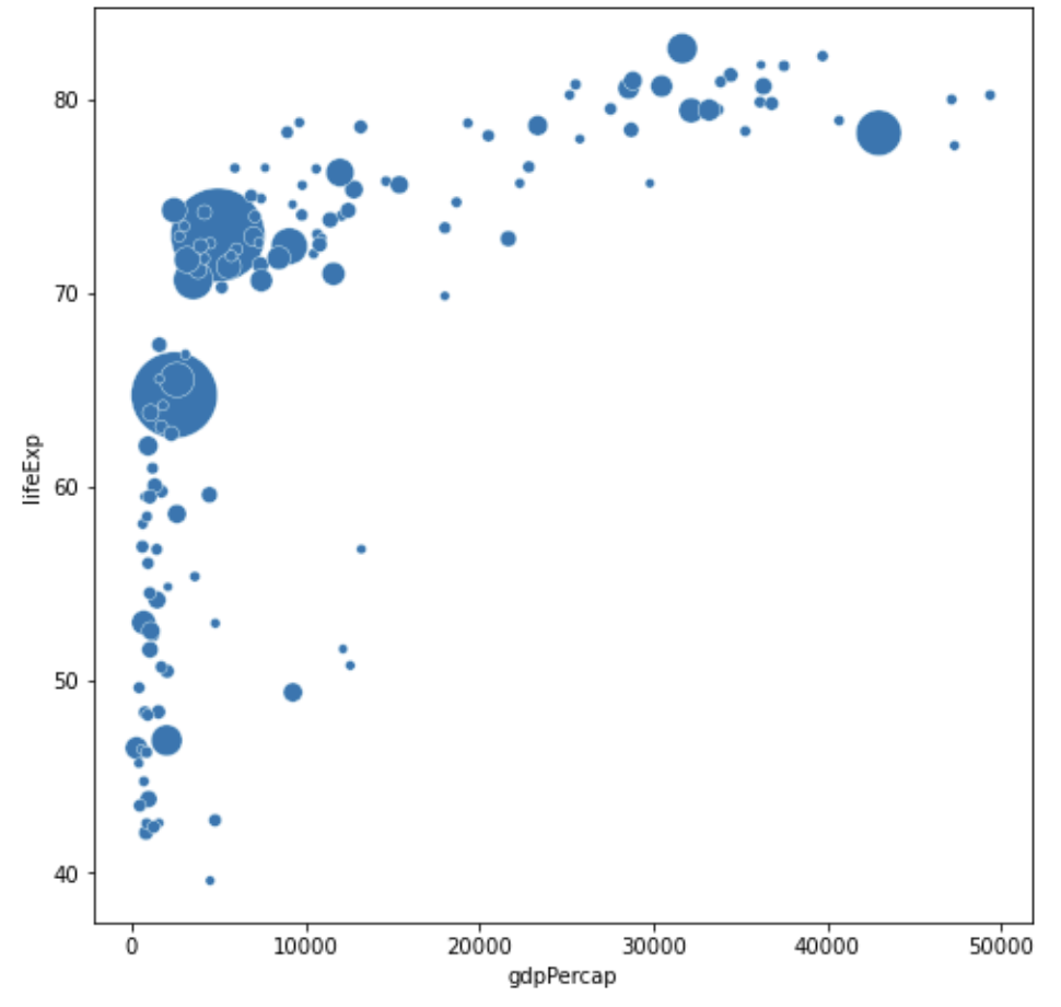
위 링크의 예시를 하나 가져와보자. gapminder 데이터 패키지를 설치하면 쉽게 그려볼 수 있다. gapminder는 국가별 경제 수준과 의료 수준 동향을 정리한 DataSet으로 분석에 다양하게 쓰인다.
# 라이브러리 불러오기
import matplotlib.pyplot as plt
import seaborn as sns
from gapminder import gapminder # import data set

# 사이즈 크기 설정
plt.rcParams['figure.figsize'] = [8, 8]

# 데이터 가져오기
data = gapminder.loc[gapminder.year == 2007]

# 버블차트를 그리기
sns.scatterplot(data=data, x="gdpPercap", y="lifeExp", size="pop", legend=False, sizes=(20, 2000))

# 그래프 출력
plt.show()
[결과값]
파이썬 공부를 해 본 사람이라면 한번씩은 봤을 그 그래프다!
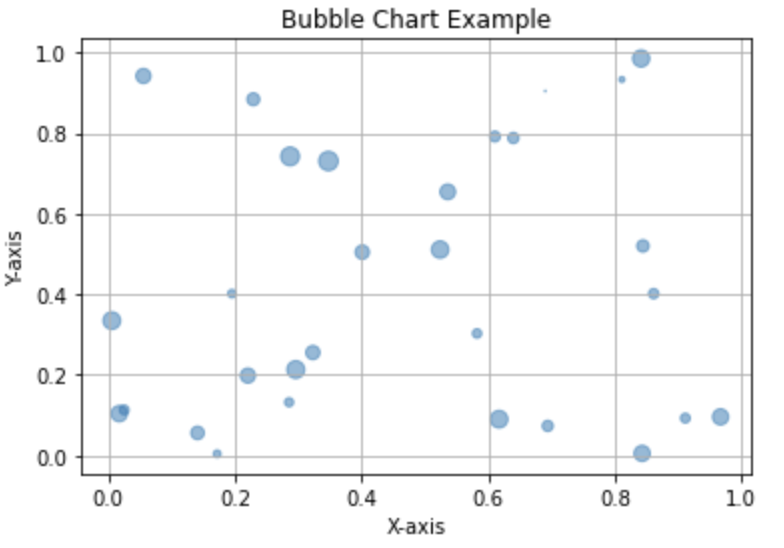
(1) 버블차트를 그리는 방법은 다양하다.
import matplotlib.pyplot as plt
import numpy as np

# 데이터 생성
num_points = 30
x = np.random.rand(num_points)
y = np.random.rand(num_points)
sizes = np.random.rand(num_points) * 100  # 크기 정보

# 버블 차트 그리기
plt.scatter(x, y, s=sizes, alpha=0.5)

# 그래프 설정
plt.title('Bubble Chart Example')
plt.xlabel('X-axis')
plt.ylabel('Y-axis')
plt.grid(True)

# 그래프 표시
plt.show()
[결과값]
버블 차트(Bubble Chart)는 산점도(Scatter Plot)와 유사하지만, 각 데이터 포인트에 크기 정보를 추가한 그래프입니다. 각각의 데이터 포인트는 x축, y축으로 위치가 지정되고, 동시에 해당 데이터 포인트의 크기가 버블의 크기로 표현됩니다. 파이썬에서 버블 차트를 그리기 위해 주로 matplotlib 라이브러리를 사용합니다. 이 코드에서는 plt.scatter 함수를 사용하여 각 데이터 포인트를 표현하고, s 인자를 통해 크기 정보를 전달합니다. alpha 인자는 투명도를 나타내며, 0에서 1 사이의 값을 가집니다. num_points 변수를 통해 데이터 포인트의 개수를 조절하고, sizes 배열을 통해 각 데이터 포인트의 크기를 랜덤하게 생성합니다. 그 결과로 더 많은 버블이 표현된 그래프가 나타납니다. 데이터의 특성에 따라서 원하는 개수나 크기로 조절하실 수 있습니다.
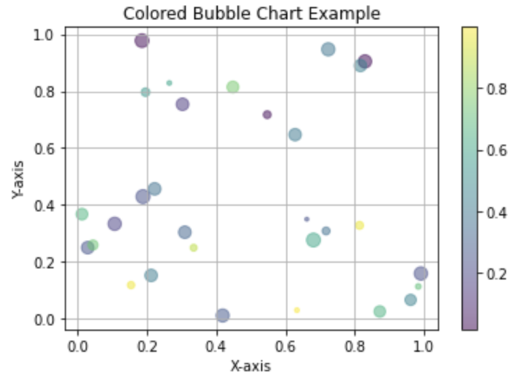
(2) 버블차트의 색상을 다양하게 그려보자
import matplotlib.pyplot as plt
import numpy as np

# 데이터 생성
num_points = 30
x = np.random.rand(num_points)
y = np.random.rand(num_points)
sizes = np.random.rand(num_points) * 100  # 크기 정보
colors = np.random.rand(num_points)  # 색상 정보

# 버블 차트 그리기
plt.scatter(x, y, s=sizes, c=colors, cmap='viridis', alpha=0.5)

# 컬러바 추가
plt.colorbar()

# 그래프 설정
plt.title('Colored Bubble Chart Example')
plt.xlabel('X-axis')
plt.ylabel('Y-axis')
plt.grid(True)

# 그래프 표시
plt.show()
[결과값]
위 코드에서는 c 매개변수를 통해 각 데이터 포인트의 색상을 설정하고, cmap 매개변수로는 사용할 컬러 맵을 지정합니다. 여기서는 'viridis' 컬러 맵을 사용하였습니다. 그리고 plt.colorbar() 함수를 사용하여 컬러바를 추가하였습니다. 컬러 맵은 matplotlib에서 제공하는 여러 가지 컬러 스키마 중에서 선택할 수 있습니다.
'Python, R 분석과 프로그래밍 > 데이터 시각화' 카테고리의 다른 글
| [python] gapminder 데이터 셋으로 여러가지 그래프 그리기 (2) | 2024.01.06 |
|---|---|
| [python] 박스 플롯 그리기 (0) | 2024.01.04 |