반응형

Gapminder 데이터셋은 세계 각 국가에 대한 시간에 따른 다양한 경제 지표 및 사회 지표를 수집한 데이터입니다. 이 데이터셋은 Gapminder Foundation에서 수집하고 제공하며, 세계의 국가들에 대한 주요 지표들의 시계열 데이터를 담고 있습니다. Gapminder 데이터셋에 포함된 주요 변수들로는 국내총생산(Gross Domestic Product, GDP), 인구, 기대수명, 출생률, 사망률, 대륙 등이 있습니다. 이 데이터셋은 연도별로 국가들의 상황을 기록하고 있어, 다양한 시각화 및 데이터 분석에 활용됩니다.


(1) 데이터 불러오기

# 라이브러리 불러오기
import pandas as pd
from gapminder import gapminder

# 데이터 불러오기
data = gapminder.copy()

# 데이터 크기 확인
data.shape


[결과값]

(1704, 6)


(2) 데이터 살펴보기

#데이터 정보 요약
data.info()


[결과값]

전체 행의 수는 1704이고, 총 6개의 열을 가지고 있습니다. 데이터 타입은 문자열(object), 정수(int64), 실수(float64)로 구성되어 있고 누락된 값은 없습니다.

<class 'pandas.core.frame.DataFrame'>
RangeIndex: 1704 entries, 0 to 1703
Data columns (total 6 columns):
 #   Column     Non-Null Count  Dtype  
---  ------     --------------  -----  
 0   country    1704 non-null   object 
 1   continent  1704 non-null   object 
 2   year       1704 non-null   int64  
 3   lifeExp    1704 non-null   float64
 4   pop        1704 non-null   int64  
 5   gdpPercap  1704 non-null   float64
dtypes: float64(2), int64(2), object(2)
memory usage: 80.0+ KB


(3) 여러가지 그래프를 그려보자

# 미국의 GDP 시계열 데이터
usa_data = data[data['country'] == 'United States']
plt.figure(figsize=(12, 6))
plt.plot(usa_data['year'], usa_data['gdpPercap'], marker='o')
plt.title('GDP per Capita Over Time (United States)')
plt.xlabel('Year')
plt.ylabel('GDP per Capita')
plt.show()


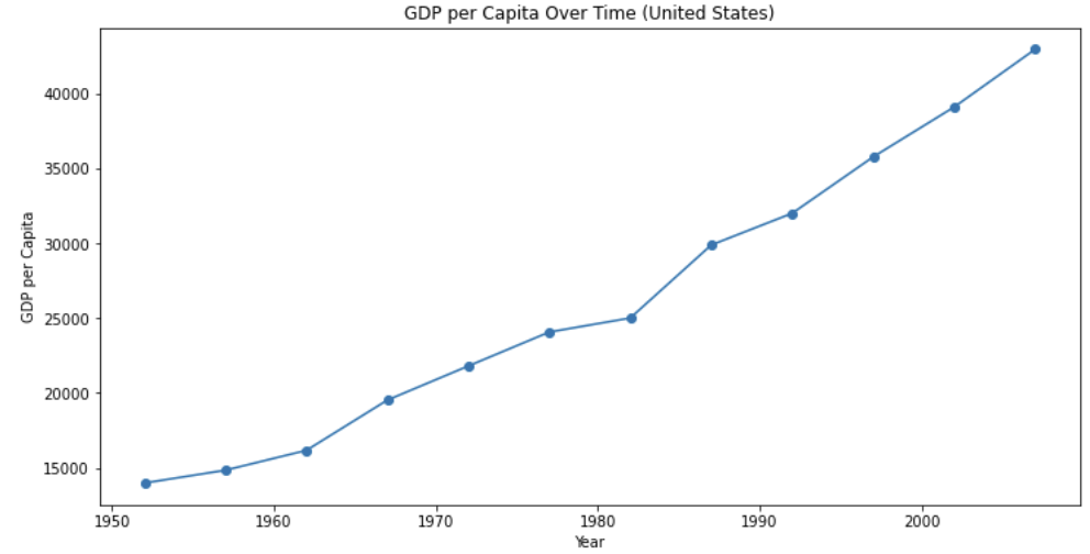
이 그래프를 통해 미국의 GDP per Capita가 연도에 따라 어떻게 변화했는지를 시각적으로 확인할 수 있습니다. 경제 성장이나 감소, 특정 시기의 변동성 등을 파악할 수 있습니다.

  1. X 축 (Year): 그래프의 x 축은 연도를 나타냅니다. 1952년부터 2007년까지의 미국의 GDP per Capita 변화를 보여줍니다.
  2. Y 축 (GDP per Capita): 그래프의 y 축은 GDP per Capita를 나타냅니다. 이 값은 해당 연도의 미국의 GDP를 인구 수로 나눈 값으로, 1인 당 평균 GDP를 의미합니다.
  3. 그래프의 형태: 그래프는 각 연도별로 미국의 GDP per Capita를 나타내는 점(line plot)으로 표현되어 있습니다. 각 점은 해당 연도의 GDP per Capita를 나타냅니다.
  4. Marker='o': 각 데이터 포인트는 동그라미(o)로 표시되어 있습니다.
  5. 그래프 제목: "GDP per Capita Over Time (United States)"라는 제목을 추가하였습니다.
  6. X 축 레이블 (Year): X 축에는 "Year"라는 레이블이 붙어 있어, X 축이 연도를 나타내는 것을 알려줍니다.
  7. Y 축 레이블 (GDP per Capita): Y 축에는 "GDP per Capita"라는 레이블이 붙어 있어, Y 축이 GDP per Capita를 나타내는 것을 알려줍니다.


# Top 10국가의 1인당 GDP 시각화
plt.figure(figsize=(14, 8))
sns.barplot(x='gdpPercap', y='country', data=top_gdp_countries, palette='viridis')
plt.title('Top 10 Countries by GDP per Capita (2007)')
plt.xlabel('GDP per Capita')
plt.ylabel('Country')
plt.show()


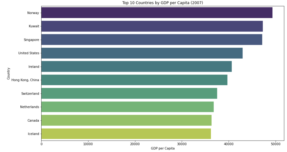
위 코드는 2007년 기준으로 상위 10개 국가의 1인당 GDP를 막대 그래프로 시각화하여 1인당 GDP가 높은 국가들을 한 눈에 볼 수 있는 장점이 있습니다.


#기대수명 vs. 1인당 GDP 산점도 그래프
plt.figure(figsize=(12, 8))
sns.scatterplot(x='gdpPercap', y='lifeExp', data=data_2007, hue='continent', palette='Set2', size='pop', sizes=(20, 2000))
plt.title('Life Expectancy vs. GDP per Capita (2007)')
plt.xlabel('GDP per Capita')
plt.ylabel('Life Expectancy')
plt.legend(title='Continent', loc='upper left')
plt.show()


  1. plt.figure(figsize=(12, 8)): 새로운 그림(figure)을 생성하고, 그림의 크기를 설정합니다. 이 경우에는 가로 12인치, 세로 8인치의 크기로 설정했습니다.
  2. sns.scatterplot(x='gdpPercap', y='lifeExp', data=data_2007, hue='continent', palette='Set2', size='pop', sizes=(20, 2000)): seaborn 라이브러리의 scatterplot 함수를 사용하여 산점도 그래프를 생성합니다. 
    • x='gdpPercap': x 축에는 1인당 GDP를 사용합니다.
    • y='lifeExp': y 축에는 기대수명을 사용합니다.
    • data=data_2007: 그래프에 사용할 데이터는 2007년의 데이터로 한정됩니다.
    • hue='continent': 대륙별로 데이터를 구분하여 다른 색상으로 표시합니다.
    • palette='Set2': 그래프에 사용할 색상 팔레트를 'Set2'로 지정합니다.
    • size='pop': 각 점의 크기는 해당 국가의 인구 크기로 나타냅니다.
    • sizes=(20, 2000): 인구 크기에 따라 표시되는 점의 크기 범위를 설정합니다.
  3. plt.legend(title='Continent', loc='upper left'): 대륙별로 다른 색상으로 표시된 점들에 대한 범례(legend)를 설정합니다. 범례의 위치는 왼쪽 상단으로 설정되어 있습니다.
  4. plt.show(): 그래프를 표시합니다.
# 상자 그림 (Box Plot) - 대륙 별 기대수명 (2007)
sns.boxplot(data=data[data['year'] == 2007], x='continent', y='lifeExp', palette='Set2')
plt.title('Box Plot - Life Expectancy by Continent (2007)')
plt.show()


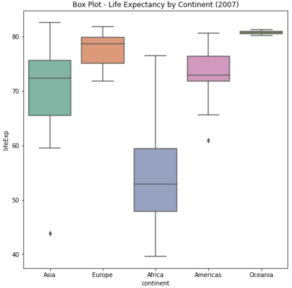
위 코드는 2007년 기준으로 대륙별 기대수명에 대한 상자 그림(Box Plot)을 생성하는 코드입니다. 이 그래프를 통해 대륙별로 기대수명의 분포를 시각적으로 확인할 수 있습니다. 각 대륙의 중앙값, 사분위수, 이상치 등이 상자 그림으로 표현되어 있습니다.

반응형
Posted by 마르띤
,
반응형


1. csv 파일 읽어 들이기

> setwd("C:/파일/temp/r_temp")

> dau<-read.csv('section4-dau.csv',header=T,stringsAsFactors = F)

> head(dau)

     log_date app_name user_id

1 2013-08-01  game-01   33754

2 2013-08-01  game-01   28598

3 2013-08-01  game-01   30306

4 2013-08-01  game-01     117

5 2013-08-01  game-01    6605

6 2013-08-01  game-01     346

> user.info<-read.csv('section4-user_info.csv',header=T,stringsAsFactors = F)

> head(user.info)

i     nstall_date app_name user_id gender generation device_type

1   2013-04-15  game-01       1      M         40         iOS

2   2013-04-15  game-01       2      M         10     Android

3   2013-04-15  game-01       3      F         40         iOS

4   2013-04-15  game-01       4      M         10     Android

5   2013-04-15  game-01       5      M         40         iOS

6   2013-04-15  game-01       6      M         40         iOS


2. DAU user.info 결합하기

> dau.user.info<-merge(dau,user.info,by=c('user_id','app_name'))

> head(dau.user.info)

     user_id app_name   log_date   install_date  gender  generation  device_type

1       1  game-01 2013-09-06   2013-04-15      M         40         iOS

2       1  game-01 2013-09-05   2013-04-15      M         40         iOS

3       1  game-01 2013-09-28   2013-04-15      M         40         iOS

4       1  game-01 2013-09-12   2013-04-15      M         40         iOS

5       1  game-01 2013-09-11   2013-04-15      M         40         iOS

6       1  game-01 2013-09-08   2013-04-15      M         40         iOS


3. 월 항목 추가

> dau.user.info$month<-substr(dau.user.info$log_date,1,7)

> head(dau.user.info)

     user_id app_name   log_date   install_date  gender generation  device_type  month

1       1  game-01 2013-09-06   2013-04-15      M         40         iOS 2013-09

2       1  game-01 2013-09-05   2013-04-15      M         40         iOS 2013-09

3       1  game-01 2013-09-28   2013-04-15      M         40         iOS 2013-09

4       1  game-01 2013-09-12   2013-04-15      M         40         iOS 2013-09

5       1  game-01 2013-09-11   2013-04-15      M         40         iOS 2013-09

6       1  game-01 2013-09-08   2013-04-15      M         40         iOS 2013-09

> colnames(dau.user.info)[8]<-'log_month'

> head(dau.user.info)

user_id app_name   log_date  install_date   gender generation  device_type log_month

1       1  game-01 2013-09-06   2013-04-15      M         40         iOS   2013-09

2       1  game-01 2013-09-05   2013-04-15      M         40         iOS   2013-09

3       1  game-01 2013-09-28   2013-04-15      M         40         iOS   2013-09

4       1  game-01 2013-09-12   2013-04-15      M         40         iOS   2013-09

5       1  game-01 2013-09-11   2013-04-15      M         40         iOS   2013-09

6       1  game-01 2013-09-08   2013-04-15      M         40         iOS   2013-09


4. 성별로 집계

> table(dau.user.info[,c('log_month','gender')])

gender

log_month     F     M

2013-08 47343 46842

2013-09 38027 38148


> table(dau.user.info[,c('gender','log_month')])

log_month

gender 2013-08 2013-09

F   47343   38027

M   46842   38148


-> 전체적인 수치는 떨어졌지만 남녀간의 구성비율은 변화가 없으므로, 성별과 게임이용율 간 연관관계가 크지 않음.


5. 연령별로 집계

> table(dau.user.info[,c('log_month','generation')])

generation

log_month    10    20    30    40    50

2013-08 18785 33671 28072  8828  4829

2013-09 15391 27229 22226  7494  3835


> table(dau.user.info[,c('generation','log_month')])

log_month

generation 2013-08 2013-09

10   18785   15391

20   33671   27229

30   28072   22226

40    8828    7494

50    4829    3835

-> 전체적인 수치는 떨어졌지만 연령간의 구성비율은 변화가 없으므로, 연령과 게임이용율 간 연관관계가 크지 않음.


6. 세그먼트 분석(성별과 연령대를 조합해서 집계)

> library(reshape2)

> dcast(dau.user.info,log_month~gender+generation,value.var='user_id',length)

log_month F_10  F_20  F_30 F_40 F_50 M_10  M_20  M_30 M_40 M_50

1   2013-08 9091 17181 14217 4597 2257 9694 16490 13855 4231 2572

2   2013-09 7316 13616 11458 3856 1781 8075 13613 10768 3638 2054


-> 전체 이용율 하락에 영햐을 끼친 세그먼트는 찾아내지 못함


7. 세그먼트 분석(단말기별로 집계)

> head(dau.user.info)

user_id app_name   log_date   install_date  gender  generation device_type log_month

1       1  game-01 2013-09-06   2013-04-15      M         40         iOS   2013-09

2       1  game-01 2013-09-05   2013-04-15      M         40         iOS   2013-09

3       1  game-01 2013-09-28   2013-04-15      M         40         iOS   2013-09

4       1  game-01 2013-09-12   2013-04-15      M         40         iOS   2013-09

5       1  game-01 2013-09-11   2013-04-15      M         40         iOS   2013-09

6       1  game-01 2013-09-08   2013-04-15      M         40         iOS   2013-09

> table(dau.user.info[,c('log_month','device_type')])

device_type

log_month Android   iOS

2013-08   46974  47211

2013-09   29647  46528

-> ios의 변화율은 없는 반면, android의 변화율이 큼을 알 수 있다.


8. 세그먼트 분석 결과 시각화하기

#날짜별로 단말기별 유저수 산출하기

> library(plyr)

> dau.user.info.device.summary<-ddply(dau.user.info,

.(log_date,device_type),

                                                   summarize,

                                                    dau=length(user_id))

> head(dau.user.info.device.summary)

log_date  device_type  dau

1 2013-08-01     Android 1784

2 2013-08-01         iOS   1805

3 2013-08-02     Android 1386

4 2013-08-02         iOS   1451

5 2013-08-03     Android 1295

6 2013-08-03         iOS   1351


#날짜별 데이터 형식으로 변환하기

> str(dau.user.info.device.summary)

'data.frame':          122 obs. of  3 variables:

$ log_date   : chr  "2013-08-01" "2013-08-01" "2013-08-02" "2013-08-02" ...

$ device_type: chr  "Android" "iOS" "Android" "iOS" ...

$ dau        : int  1784 1805 1386 1451 1295 1351 1283 1314 2002 2038 ...

> dau.user.info.device.summary$log_date<-as.Date(dau.user.info.device.summary$log_date)

> str(dau.user.info.device.summary)

'data.frame':  122 obs. of  3 variables:

$ log_date   : Date, format: "2013-08-01" "2013-08-01" "2013-08-02" ...

$ device_type: chr  "Android" "iOS" "Android" "iOS" ...

$ dau        : int  1784 1805 1386 1451 1295 1351 1283 1314 2002 2038 ... 


9. 시계열 트렌드 그래프 그리기

> library(ggplot2)

> library(scales)

> limits<-c(0,max(dau.user.info.device.summary$dau))

> ggplot(dau.user.info.device.summary,aes(x=log_date,y=dau,col=device_type,lty=device_type,shape=device_type))+ geom_line(lwd=1)+geom_point(size=4)+scale_y_continuous(label=comma,limits = limits)


-> 9월부터 안드로이드 유저가 빠르게 감소함을 알 수 있다. 따라서 안드로이드 시스템을 점검해야 한다는 결론을 얻을 수 있다.


#ggplot 그래프 구조 이해하기

> library(ggplot2)

> library(scales)

> head(dau.user.info.device.summary)

log_date device_type  dau

1 2013-08-01     Android 1784

2 2013-08-01         iOS 1805

3 2013-08-02     Android 1386

4 2013-08-02         iOS 1451

5 2013-08-03     Android 1295

6 2013-08-03         iOS 1351

> ggplot(dau.user.info.device.summary)


> ggplot(dau.user.info.device.summary,aes(x=log_date,y=dau,col=device_type,lty=device_type,shape=device_type))


> ggplot(dau.user.info.device.summary,aes(x=log_date,y=dau,col=device_type,lty=device_type,shape=device_type))+geom_line(lwd=1)


> ggplot(dau.user.info.device.summary,aes(x=log_date,y=dau,col=device_type,lty=device_type,shape=device_type))+geom_line(lwd=1)+geom_point(size=4)


> ggplot(dau.user.info.device.summary,aes(x=log_date,y=dau,col=device_type,lty=device_type,shape=device_type))+geom_line(lwd=1)+geom_point(size=4)+scale_y_continuous(label=comma)


> limits<-c(0,max(dau.user.info.device.summary$dau))

> max(dau.user.info.device.summary$dau)

[1] 2133

> ggplot(dau.user.info.device.summary,aes(x=log_date,y=dau,col=device_type,lty=device_type,shape=device_type))+geom_line(lwd=1)+geom_point(size=4)+scale_y_continuous(label=comma,limits = limits)


출처: 비지니스 활용 사레로 배우는 데이터 분석: R (사카마키 류지, 사토 요헤이 지음)


반응형
Posted by 마르띤
,